Empathy has been a keyword in Design Thinking over the past decade, a skill required to create a thoughtful, soulful design. Being human-centred requires empathy, as it is the foundation of understanding. I regard empathy as being able to put myself in the other person’s shoes in order to deeply understand the person’s feelings, motivations and challenges.

From a design perspective, through this empathetic way of thinking, designers are more likely to create effective solutions. However, let’s expand upon this idea of empathy to include how we ourselves act on our attempts to understand. While empathy is essential, let us make this decade about being mindful. To be effective with design thinking in learning design, we need to include mindfulness at every step.
For example, take a look at any Word document you might be using in your class. Our beginner’s guide can start right there.
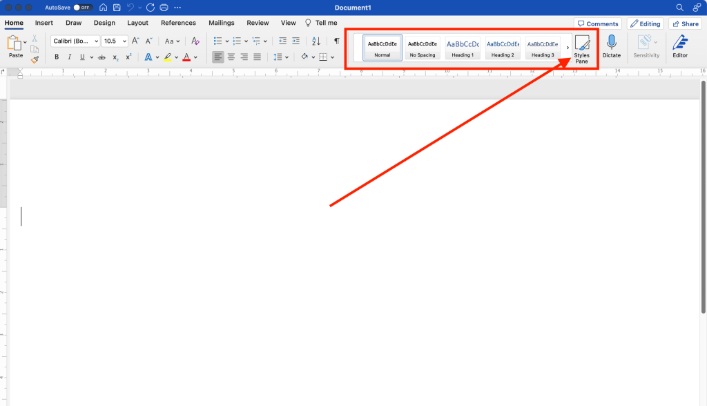
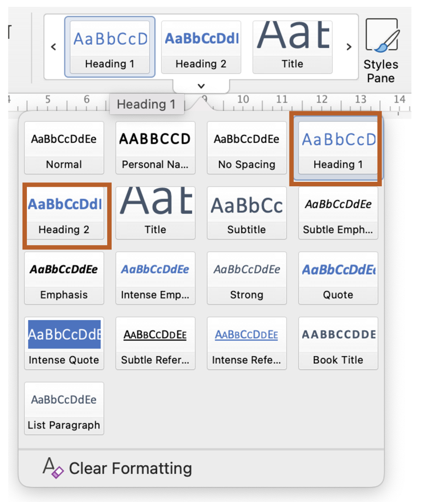
For easy-to-read accessible content, use headings and subheadings. Adding headings and subheadings will add structure and navigability to your documents, allowing people with learning disabilities to jump to their desired content. Headings put content in groups and allow users with screen readers to jump through the topics that interest them. Heading 1 is the biggest and refers to the title of the subject, and Heading 6, the smallest, is the subsection heading. To format content in Word, use the Style Pane on the ribbon. “Styles Pane” in Microsoft Word and choose your Heading 1, 2 and so on. If you just adjust your headings with bold or italics, your students who use screen readers will miss your visual attempts at structuring a document.
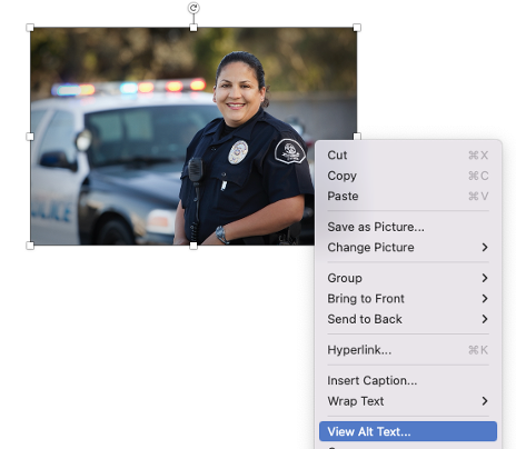
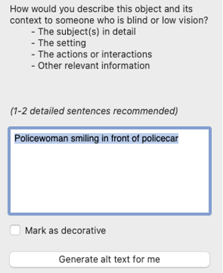
The ALT stands for Alternative. ALT text describes an image for people who cannot see it because they use a screen reader or because the image did not load. The purpose of ALT text is to provide an equivalent experience to all learners, even if they cannot view the image. ALT images can be brief but descriptive. I recommend 100 characters. They should describe the image in such a way that it can generate an equivalent emotional quotient for the person seeing the image.
Microsoft Word allows users to generate ALT text descriptions using an inbuilt AI (artificial intelligence) feature. To do this:·
The AI-driven ALT-text will give you an idea of what to add in the image description field to support the content though it is rarely adequate for your purposes. You may wish to adjust the description to suit the context of which your image is a part.
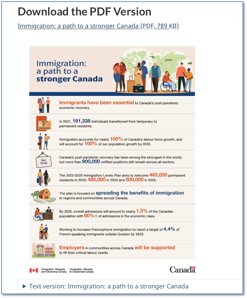
for the person using a screen reader to have an equivalent experience. If the infographic text is more than 100 characters, it is better to include the details of the infographic in a text version instead.
Here is an example of an infographic supported with a text version from the Canadian government website:
Do not rely solely on colour when presenting comparative data.
Visually impaired learners see colour differently. For example, a person with colour blindness will see red and greens differently and is not likely to differentiate between the two colours. Supporting the graphic with relevant labels provides more clarity and will build an equivalent experience. The image below compares how visually impaired persons may view colour differently.
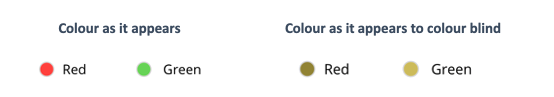
Try out this Color Blindness Simulator tool to see how your image might appear to students with colour blindness.
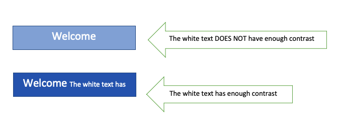
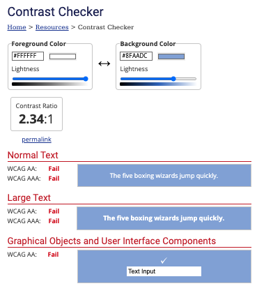
Add enough contrast for legibility and readability. The graphic below shows how the white text does not have enough contrast and will not meet the accessibility requirement as per WCAG AA guidelines. Another tool you can try to check if your font/graphic colours meet the contrast requirement is Webaim Contrast Checker.
Ideally, the contrast between the text and background should be greater than or equal to 4.5:1 for small text and 3:1 for large text, as per WCAG AA guidelines.
For hyperlinks, avoid using generic text such as click here or read here, as screen readers will not know where these links go, as these are not descriptive enough for screen readers. Instead, use descriptive text for hyperlinks. For example, “watch the graduation ceremony” or “2023 budget report. Additionally:
While my heart, spirit, and soul live young, my vision cannot keep up with my young heart. Age is catching up to me. This is my barrier to learning and I am more vocal about not being able to read smaller font sizes or not being able to read PowerPoint slides from the projector. It sometimes becomes embarrassing; at that moment, I would like to hide behind people or rely solely on my listening skills to consume the content.
Fonts sizes are essential to making content accessible for people with disabilities and for people regardless of their age.
It is simple and easily achievable. Use the inbuilt table feature in Word by choosing the Insert menu and clicking on Table. Make sure to give headings to columns and rows as needed.
For people with vision, cognition and hearing disabilities, creating more inclusive learning content is imperative so everyone can have an equivalent experience.
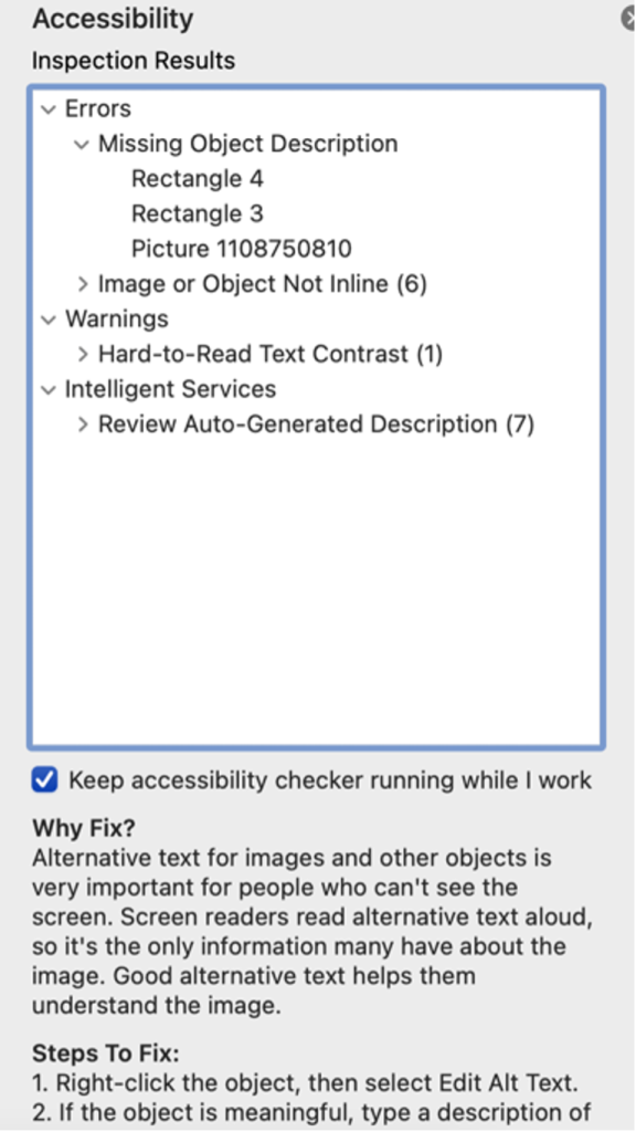
As you develop documents , you could check if your document meets Accessibility requirements. To do that, in Microsoft Word click on Tools > Accessibility check to view the Inspection Results. Consider these inspection results as your friend and guide. Use these inspection results to fix your documents. Pay special attention to Errors and Warnings for a must-fix.
If you’re unsure on how to fix it, Follow the instructions for Steps to Fix it found at the bottom of the tool.
Use these simple techniques above as you build a syllabus, learning modules, and resources for your courses. Don’t be afraid to ask for help, practice, develop, test, repeat and share.
As we press forward for progress, let us be empathetic and mindful.
If you would like to connect and have conversations, we would be happy to talk to you.

This list adapted from Checklist for Accessibility, Accessibility Toolkit – 2nd Edition by BCcampus, CC BY 4.0.